
36 Days of Type
36 Days of Type is a global project that invites Designers, Illustrators and Graphic Artist to express their particular view on letters and numbers of our alphabet. In 36 days of restless creativity, participants were challenged to design a letter or number each day resulting to present the same alphabet and number from many different perspectives. This is a project that aims to create a space for creativity around typography and its endless graphic possibilities.
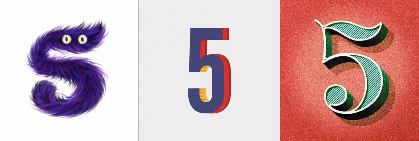
Source from 36 Days of Type FB Page
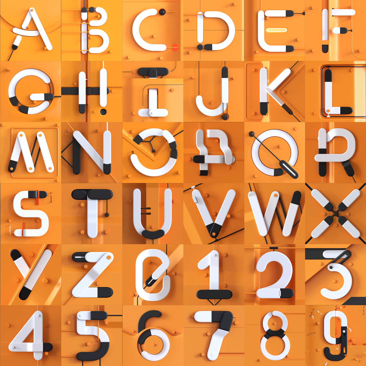
This is the 5th edition of 36 Days of Type and I decided to participate. I’ve known this challenge for a long time but this year, I was hungry for more creativity. I realized, this project is perfect on how I can further expand my skills as a motion designer and showcase it.
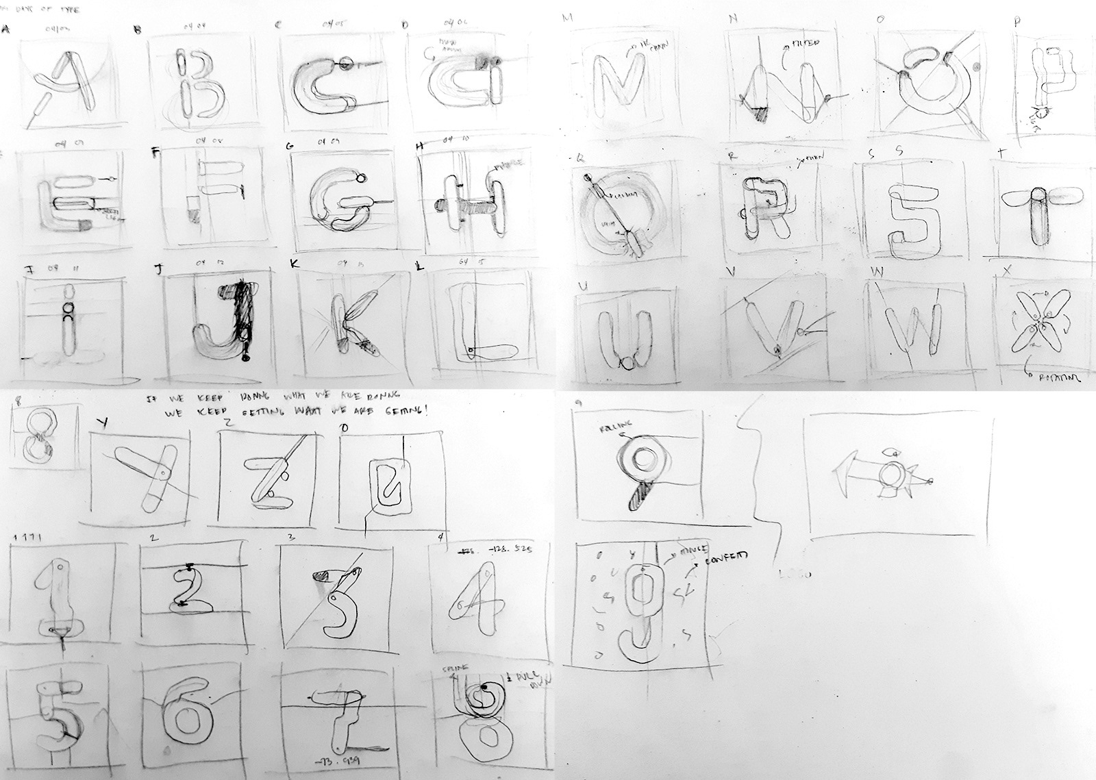
The hardest part is to start. As it is my first time to participate, I really had a little idea on what to do. I didn’t want to get ideas over the internet so I refrained from looking at references. But one thing is for sure: I needed to be consistent in this project. I started sketching my ideas. Surprisingly, it didn’t take much time because I was really liking the sketches.
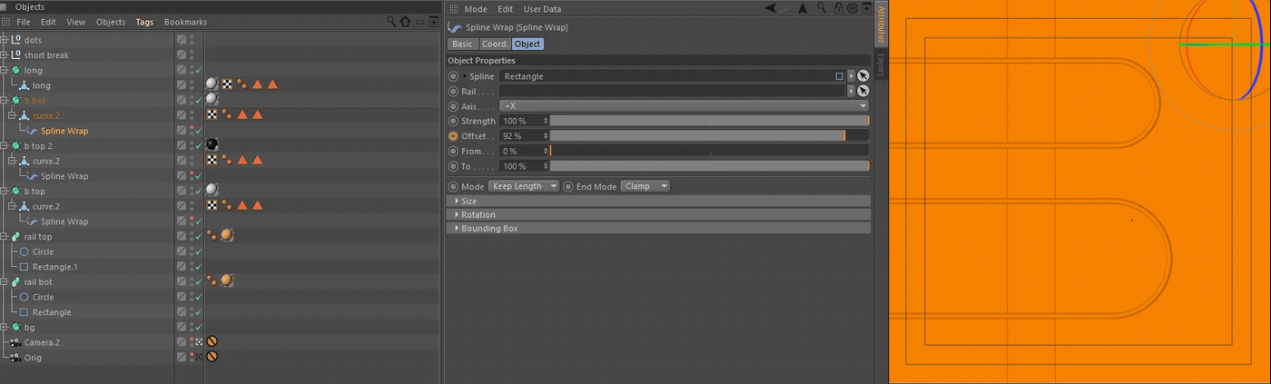
I used Cinema 4D to create, animate and render each letter and number. I started thinking about the best way to animate each object. There are a few options for animation but I decided that the best way was to make use of splines. I used a deformer called Spline Wrap. This is a really powerful tool to move objects. I just needed to tell the deformer on which spline I wanted my object to take form in and after a few clicks …boom! There you have it.
Aside from splines, others forms that incorporate rotations are there such as: pivot, tilt, and curves. This way, I can use them alternatively on each letter to make them different from each other.
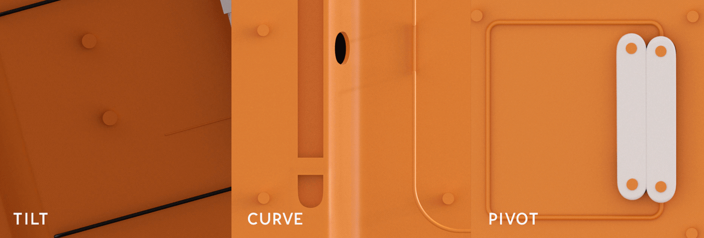
These letters are examples of tilt, curve, and pivot.
These are some color palettes I tried but the orange one looks more appealing to me.
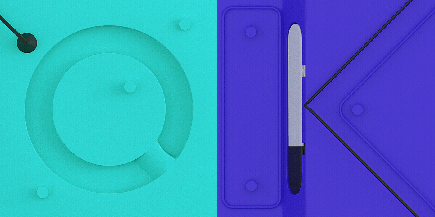
Other color options.
This whole challenge was really fun. Although, I must admit it got a little boring midway because of doing the same palette, animation and idea. It challenged me on how I can make it more interesting by making each letter and number different while being consistent in the same time.
I learned a whole lot from this project, I discovered few things about myself as well. Doing this project every day for 36 days was no joke. Having a day job for 8 hours and working on this had me running on a few hours of sleep but all those nights of grinding were all worth it. I even landed a freelance job from doing all these letters. How cool is that!
I was able to collaborate as well with Gustavo @bythelake.studio, a music studio based in Rio. I was really not expecting it, I even told him I don’t have a budget for it but he just wanted to collaborate. All the amazing SFX you heard from this project were all made from them. They’re really amazing guys and I would love to do more projects with them in the future.
But most importantly, I gained online friends from all the appreciations and warm comments I received. This year couldn’t get any better, it made me believe that what I do is something I should keep on doing. A huge thanks to @travisragsdale who showed so much love in this series! Thanks man!
A few people were asking for a breakdown or a tutorial video, unfortunately I can’t do it right now. But soon enough, I will! Better late than never.
For now, here are few tutorials that helped me tremendously build this series:
Resources
These are the tutorials that helped me in this project